Best Tools Shaping the World of Web Design in 2022
Posts by Alan TaylorApril 25, 2022
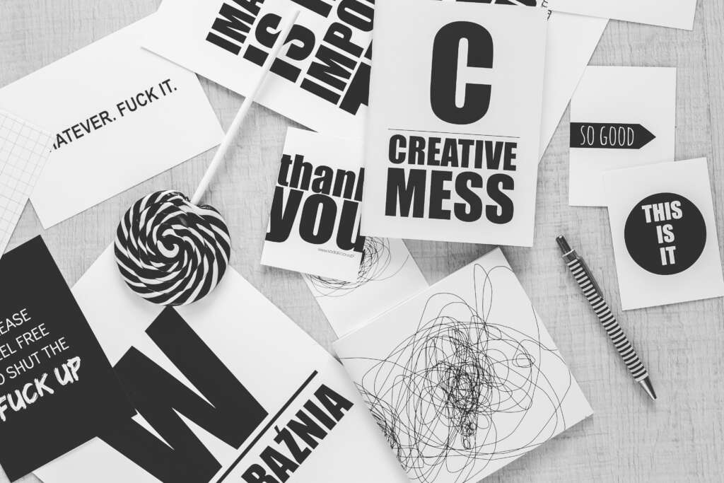
Your website is a go-to destination for exceptional information. It’s a place where, no matter what, potential buyers will find at least a few interesting items to keep on your site. Typography is taking center stage this year, and therefore there’s no better way to advance your website than by understanding the best fonts that match your brand’s vision.
More than 95% of the information on the internet is in the form of written text. Poor typography turns consumers off, whereas good typography makes reading effortless. “Web Design is 95 percent Typography,” writes Oliver Reichenstein in his paper.
There are around 650,000 fonts available online, including variations. Most web browsers support Web-safe fonts, and operating systems contain them automatically.
In 2022 typographic trends, there will be a transition from incomprehensible novelty fonts to more open, adaptable, and inclusive typefaces. As the Internet gets increasingly crowded, big corporations are changing to better digital identities, and typography plays a critical part.
Fancy serif styles are being replaced by fluid, straightforward scripts and rustic serifs, while rounded sans serifs are welcome and UX-friendly. The most popular fonts in 2022 will have an open and honest personality, with legibility and web accessibility as serious concerns. These typeface trends may be modest, but they’re all stylish.
Make Your Typography Legible and Comprehensible
The importance of typography cannot be overstated. Typography should always respect the text while never adding to the user’s cognitive load. Here’s how to make the most of the best tool for making your website stand out: fonts.
Keep the Number of Fonts to A Bare Minimum
A website that uses more than three different typefaces appears disorganized and unprofessional. Using too many different types, sizes, and styles simultaneously can ruin your design. You should keep the number of font families on your website minimal and use the same ones all around. If you’re utilizing more than one typeface, make sure the font families are compatible with the character width.

Make an Effort to Use Standard Fonts
Font embedding providers like Google Web Fonts have a large selection of appealing fonts that add something new, fresh, and surprising to your designs. That method has one major flaw: appealing typefaces can cause consumers to stop reading.
It’s better to stick with the system typefaces unless your website has a compelling need for a custom font for branding purposes or to provide an immersive experience. It’s important to remember that effective typography pulls the reader’s attention to the text rather than the type itself.
Line Length Restrictions
The readability of your writing depends on the number of characters on each line. It should not only be a question of legibility that determines the width of your text; it should also be a matter of design. You should aim for 30–40 characters per line on mobile devices. You may get an appropriate number of characters per line in web design by utilizing pixels to limit the width of your text blocks.
Select a Typeface That Works Good at Different Sizes
People will access your site from various devices with varying screen sizes and resolutions. Text components of varied sizes are required in most user interfaces (button copy, field labels, section headers, etc.). To preserve readability and usability at all sizes, choose a typeface that performs well in various sizes and weights. Make sure the typeface you select is readable on small screens.
Make Use of Fonts with Distinct Letters
Many typefaces make it all too simple to mix up similar letterforms. So, while choosing a type, make careful to test it in various situations to ensure it won’t cause problems for your users.
Use Capital Letters Sparingly
Text with all letters capitalized is acceptable in circumstances that don’t require reading (e.g. acronyms, logos) but don’t compel your users to read all capitals text when your message requires reading.
Don’t Minimize Spacing Between Lines
In return for screen real estate, increasing the leading increases the vertical white space between lines of text, enhancing readability. The leading should be around 30% larger than the character height for excellent reading. The use of white space between paragraphs has been shown to boost comprehension by up to 20%.

Make Certain There Is Enough Color Contrast
Text and backdrop should not be the same or similar colors. Users can scan and read material faster if it is more visible. Once you’ve decided on a color, you’ll need to test it with real consumers on various devices.
Avoid Using Blinking Text
Text that flashes or flickers can cause seizures in those who are vulnerable. It has the potential to produce seizures and be bothersome or distracting to users in general.
Last Thoughts
There are many font ideas available to you, just as there are with themes and plugins. Fonts are a wonderful place to start when establishing a site, with various serif, sans serif, monospace, and even cursive fonts accessible for free.
Your website will stand out with the right fonts, which will boost readability and complement your message. Better decide!
